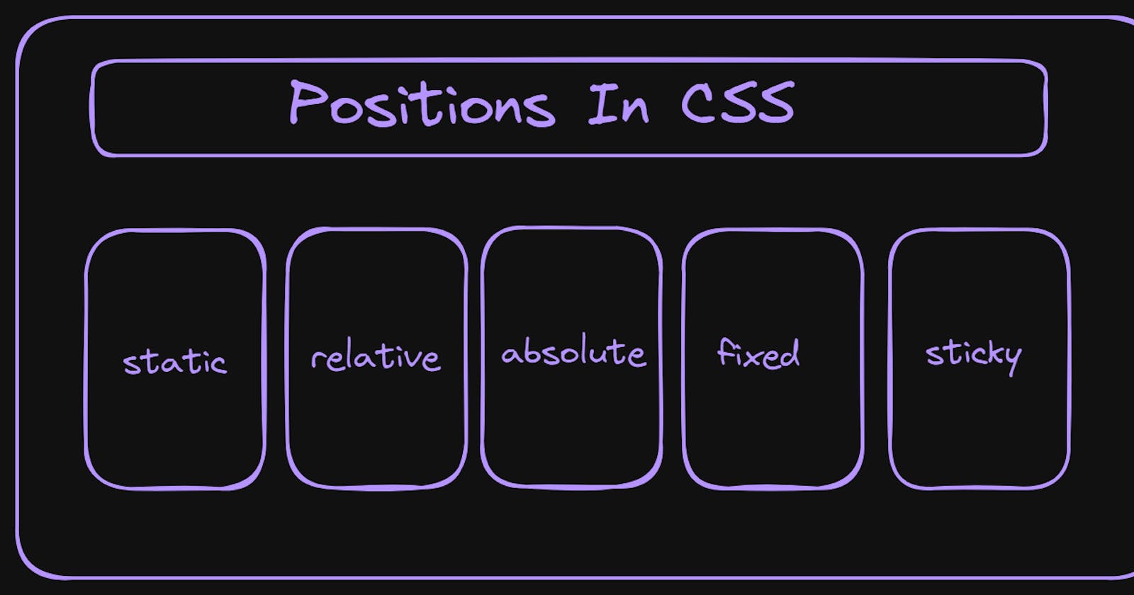


The position property helps us to determine where the element is placed/positioned in the document. It is having four properties they are top, bottom, left and right. Now lets discuss what are different types in it in detail

Static Position
This is default positioning scheme for elements.
Elements flow according to the normal document flow.
This properties like top, bottom, left and right will not show any affect on this because it is default position for elements.
Example:
<!DOCTYPE html>
<html lang="en">

<head>
    <meta charset="UTF-8">
    <meta name="viewport" content="width=device-width, initial-scale=1.0">
    <title>Static Position</title>
    <link rel="stylesheet" href="../CSS/positions.css">
</head>

<body>
    <div class="container-one">static</div>
    <div class="container">relative</div>
    <div class="container">absolute</div>
    <div class="container">fixed</div>
</body>
</html>
.container-one {
    background-color: bisque;
    height: 50px;
    width: 50px;
    border: 2px solid black;
    padding: 40px;
    margin: 10px;
    border-radius: 2px;
    text-align: center;

}
.container {

    height: 50px;
    width: 50px;
    border: 2px solid black;
    padding: 40px;
    margin: 10px;
    border-radius: 2px;
    text-align: center;
    position: static;
}
Output:

Relative Position
Elements are positioned relative to their original positions in document flow.
We can use properties and move the element with out effecting surrounding elements.
Example:
<!DOCTYPE html>
<html lang="en">

<head>
    <meta charset="UTF-8">
    <meta name="viewport" content="width=device-width, initial-scale=1.0">
    <title>Relative Position</title>
    <link rel="stylesheet" href="../CSS/positions.css">
</head>
<body>
    <div class="container">static</div>
    <div class="container-one">relative</div>
    <div class="container">absolute</div>
    <div class="container">fixed</div>
</body>
</html>
.container-one {
    background-color: bisque;
    height: 50px;
    width: 50px;
    border: 2px solid black;
    padding: 40px;
    margin: 10px;
    border-radius: 2px;
    text-align: center;
    display: inline-block;
    position:relative;
    top:  55px;
    left: 55px;
}
.container {
    height: 50px;
    width: 50px;
    border: 2px solid black;
    padding: 40px;
    margin: 10px;
    border-radius: 2px;
    text-align: center;
    display: inline-block;
}
Output:

Absolute Position
Elements are positioned relative to the nearest parent( parent element with a position other than static).
They are completely removed from document flow and will not get effected by surrounding elements.
Example:
<!DOCTYPE html>
<html lang="en">

<head>
    <meta charset="UTF-8">
    <meta name="viewport" content="width=device-width, initial-scale=1.0">
    <title>Absolute Position</title>
    <link rel="stylesheet" href="../CSS/positions.css">
</head>
<body>
    <div class="container">static</div>
    <div class="container">relative</div>
    <div class="container-one">absolute</div>
    <div class="container">fixed</div>
</body>
</html>
.container-one {
    background-color: bisque;
    height: 50px;
    width: 50px;
    border: 2px solid black;
    padding: 40px;
    margin: 10px;
    border-radius: 2px;
    text-align: center;
    display: inline-block;
    position:absolute;
    top: 2px;
    left: 500px;
     }
.container {
    height: 50px;
    width: 50px;
    border: 2px solid black;
    padding: 40px;
    margin: 10px;
    border-radius: 2px;
    text-align: center;
    display: inline-block;
}
Output:

Fixed Position
Elements are positioned relative to viewport i.e (browser window).
They remain fixed in the position even though you perform any action the position of it remains same.
Example:
<!DOCTYPE html>
<html lang="en">

<head>
    <meta charset="UTF-8">
    <meta name="viewport" content="width=device-width, initial-scale=1.0">
    <title>Fixed Position</title>
    <link rel="stylesheet" href="../CSS/positions.css">
</head>

<body>
    <div class="container">static</div>
    <div class="container">relative</div>
    <div class="container">absolute</div>
    <div class="container-one">fixed</div>
</body>
</html>
.container-one {
    background-color: bisque;
    height: 50px;
    width: 50px;
    border: 2px solid black;
    padding: 40px;
    margin: 10px;
    border-radius: 2px;
    text-align: center;
    display: inline-block;
    position:fixed;
    top: 1px;
    right: 34px;
     }
.container {
    height: 50px;
    width: 50px;
    border: 2px solid black;
    padding: 40px;
    margin: 10px;
    border-radius: 2px;
    text-align: center;
    display: inline-block;
}
Output:

Sticky Position
It allows elements to stay anchored to specific part of the viewport or its container as user scrolls. It combines aspects of both relative and fixed positioning
Example:
*Here i am using lorem500 in order to get 500 words for better output visualization (code becomes so large so haven't represented 500 words)
<html lang="en">

<head>
    <meta charset="UTF-8">
    <meta name="viewport" content="width=device-width, initial-scale=1.0">
    <title>Sticky Header Example</title>
    <link rel="stylesheet" href="../CSS/positions.css">
</head>
<body>
  <header class="sticky-header">
    <h1>Sticky Header</h1>
  </header>
    <p>Lorem ipsum dolor sit a lorem500</p>
</body>
</html>
.sticky-header {
      position: sticky;
      top: 0;
      background-color: lightblue;
      padding: 10px;
    }
Output:

