Media Query
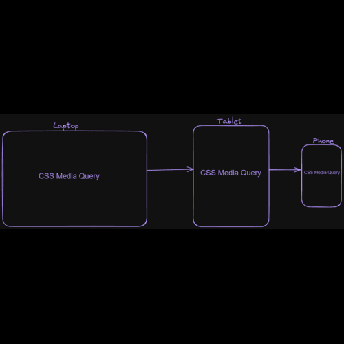
Media Queries are conditional statements in CSS that let you apply style based on specific media features like screen size, device type and orientation or resolution. They are responsible for creating responsive websites with respect to different devices.
Layman's Explanation
Imagine your website as a chameleon adapting its appearance based on the platform it's on. Media Queries are like its magic chameleon skin. They let you tell the website "Hey if you are using a phone, shrink the font size for easier reading " or if its big screen show different view.
Example:
<!DOCTYPE html>
<html>

<head>
    <title>Responsive Website Example</title>
    <link rel="stylesheet" href="../CSS/style.css">
</head>

<body>

    <header>
        <h1>My Responsive Website</h1>
    </header>

    <main class="content">
        <article>
            <h2>Article 1</h2>
            <p>This is Article One.</p>
        </article>
        <article>
            <h2>Article 2</h2>
            <p>This is Article Two.</p>
        </article>
    </main>

</body>

</html>
body {

    margin: 0;
}

header {
    background-color: orange;
    padding: 20px;
}

.content {
    margin: 20px;
}

article {
    margin-bottom: 20px;
    border: 1px solid #ccc;
    padding: 10px;
}


@media screen and (max-width: 600px) {
    .content {
        width: 100%;
        /* Full width on small screens */
    }

    article {
        display: block;

    }
}

@media screen and (min-width: 601px) and (max-width: 900px) {
    .content {
        display: flex;
        /* on medium screens */
        flex-wrap: wrap;
    }

    article {
        width: 50%;

    }
}

@media screen and (min-width: 901px) {
    .content {
        display: flex;
        /* wider spacing on large screens */
        justify-content: space-between;
    }

    article {
        width: 45%;
        /* Adjust for spacing */
    }
}
Output:
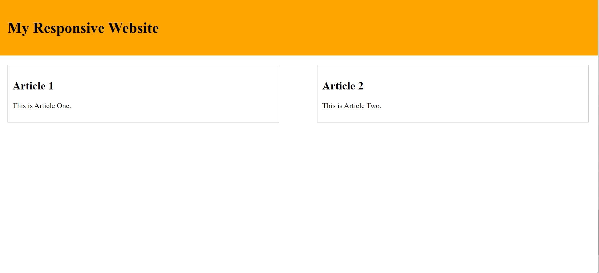
Full Screen
Medium Size
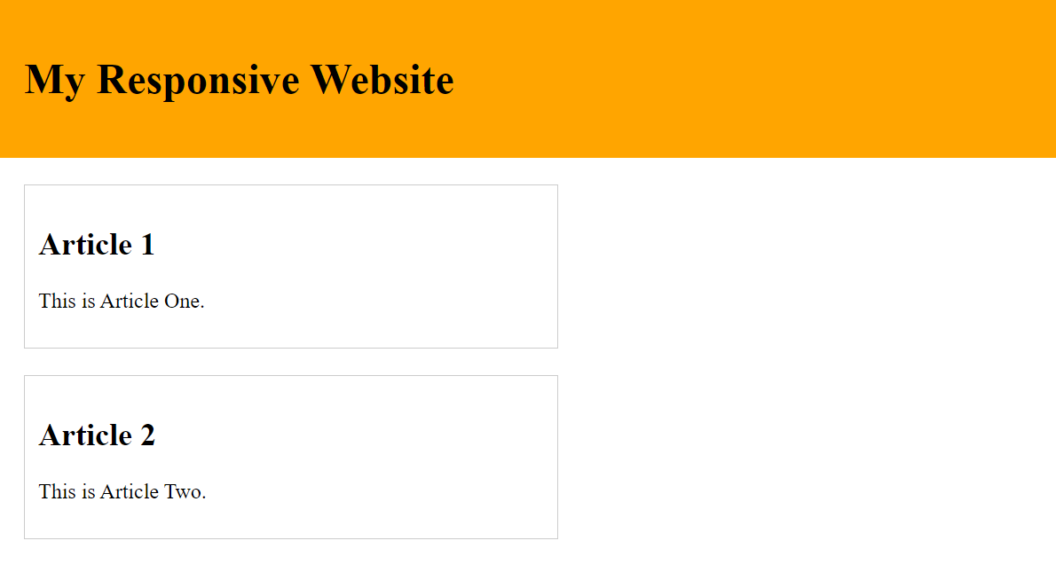
Small Size
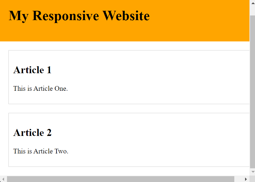
The output is slightly varied based on the width of the screens sizes.