

Table of contents
What is Flexbox?
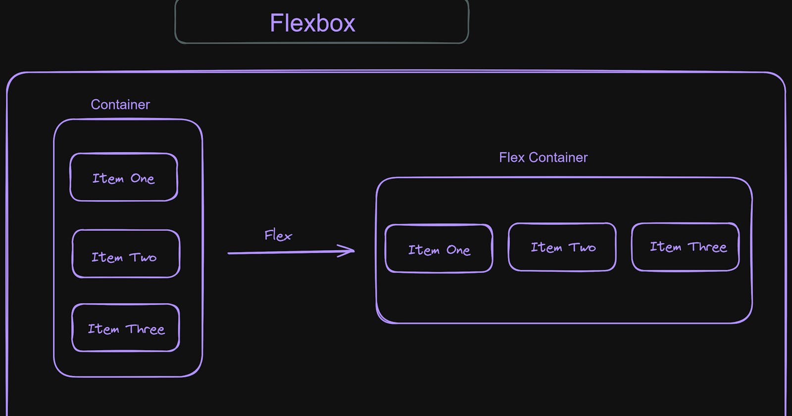
Flexbox is like a friendly helper for organizing and arranging things on a webpage, it makes our work easier for not only creating layouts but only looks good on different devices as well.

Flex Container
Flex container is like a box that holds and organizes other boxes inside a webpage. when you make an element as flex container you can able to control how the items are positioned, aligned and spaced.
Example:
<!DOCTYPE html>
<html lang="en">

<head>
    <meta charset="UTF-8">
    <meta name="viewport" content="width=device-width, initial-scale=1.0">
    <title>Flexbox</title>`
    <link rel="stylesheet" href="../CSS/art.css">
</head>

<body>

    <div class="container">

       <div class="item">Box One</div>
       <div class="item">Box Two</div>
       <div class="item">Box Three</div>
       <div class="item">Box Four </div>
       <div class="item">Box Five</div>


    </div>


</body>

</html>
.container{

    display: flex;

}

.item{


    border: 2px solid black;
    margin: 10px;
    background-color:yellow;

}
Output:

Flex Direction
Flex Direction allows us to decide if the items should be placed left to right, right to left, top to bottom or bottom to top in the container. It accepts four values they are
row - The items are displayed in row wise manner.
row-reverse - The items are reversed in row wise.
column - The items are displayed in column wise.
column-reverse - The items are reversed in column wise.
Example:
<!DOCTYPE html>
<html lang="en">

<head>
    <meta charset="UTF-8">
    <meta name="viewport" content="width=device-width, initial-scale=1.0">
    <title>Flexbox</title>
    <link rel="stylesheet" href="../CSS/art.css">
</head>

<body>

    <div class="container">


        <div class="item">One</div>
        <div class="item">Two</div>
        <div class="item">Three</div>
        <div class="item">Four</div>
        <div class="item">Five</div>


    </div>


</body>

</html>
.container {

    display: flex;
    flex-direction: row;

}

.item {


    border: 2px solid black;
    margin: 30px;
    background-color: yellow;
    padding:30px;
}
Output:

.container {

    display: flex;
    flex-direction: row-reverse;

}
Output:

.container {

    display: flex;
    flex-direction: column;

}
Output:

.container {

    display: flex;
    flex-direction: column-reverse;

}
Output:

Regarding alignment we are having two different properties one is justify-content and align-items lets look into those
Justify Content:
It is used to align items in vertical manner. It accepts different values lets see few of them
flex-start - Items are at the start in vertical order.
flex-end - Items are at the end in vertical order.
center - Items are centered in vertical order.
space-between - Items are placed by having space between them.
space-around - Items are placed by having space around them.
Example:
<!DOCTYPE html>
<html lang="en">

<head>
    <meta charset="UTF-8">
    <meta name="viewport" content="width=device-width, initial-scale=1.0">
    <title>Flexbox</title>
    <link rel="stylesheet" href="../CSS/art.css">
</head>

<body>

    <div class="container">


        <div class="item">One</div>
        <div class="item">Two</div>
        <div class="item">Three</div>
        <div class="item">Four</div>
        <div class="item">Five</div>


    </div>


</body>

</html>
.container {

    display: flex;
    justify-content: space-between;

}

.item {


    border: 2px solid black;
    margin: 30px;
    background-color: yellow;
    padding:30px

}
Output:

.container {

    display: flex;
    justify-content: space-around;

}
Output:

.container {

    display: flex;
    justify-content: center;
}

Align Items
It is used to align items in horizontal manner. It accepts different values lets see few of them
flex-start - Items are placed at start in horizontal order.
flex-end - Items are placed at end in horizontal order.
center - Items are placed at center in horizontal order.
baseline - Items are placed at their baselines.
stretch - Items are stretched to fill entire axis.
Example:
<!DOCTYPE html>
<html lang="en">

<head>
    <meta charset="UTF-8">
    <meta name="viewport" content="width=device-width, initial-scale=1.0">
    <title>Flexbox</title>
    <link rel="stylesheet" href="../CSS/art.css">
</head>

<body>

    <div class="container">


        <div class="item">One</div>
        <div class="item">Two</div>
        <div class="item">Three</div>
        <div class="item">Four</div>
        <div class="item">Five</div>


    </div>


</body>

</html>
.container {

    display: flex;
    height: 200px;
    border: 2px solid black;
    align-items: baseline;

}

.item {


    border: 2px solid black;
    margin: 30px;
    background-color: yellow;
    padding:30px

}
Output:

.container {

    display: flex;
    height: 200px;
    border: 2px solid black;
    align-items: center;

}
Output:

.container {

    display: flex;
    height: 200px;
    border: 2px solid black;
    align-items: flex-end;

}
Output:

